I’ve been busy dedicating myself to finding the funniest web design comics on the internet! After much “research” and countless websites, I have narrowed it down to the following funny web design comics that I believe a lot of web designers will be able to relate to.
Top 10 Funniest Web Design Comics
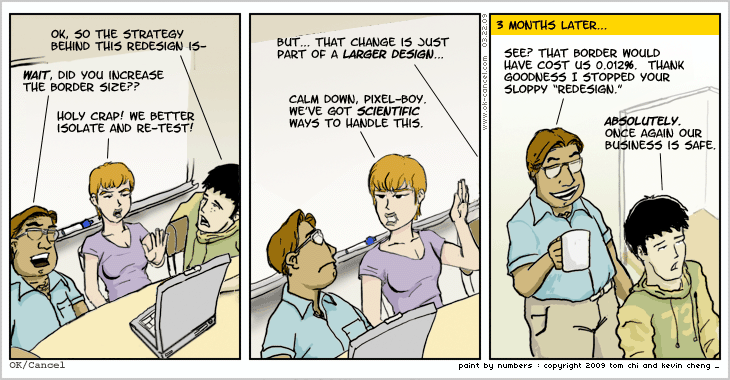
1) Every Detail Matters

When it comes to web design, every detail matters. Everything on the page has to be optimised for conversions and deliver a good user experience. But at what point does it get a bit much?
2) Web Design Constructive Criticism

Have you ever tried to get constructive criticism out of someone about a new web design? Where do you go from “it feels like Satan is licking my brain”? It’s hard to get straight forward suggestions for improvement sometimes…
3) “Can you make it more like Pinterest?”

Sometimes clients want websites that look like their favourite website. Even though both websites have absolutely nothing in common, and their favourite website design just wouldn’t work for their website. But, you know, Pinterest is very designy.
4) Trying To Decipher What The Client Wants

Sometimes clients don’t know what they want. Or maybe they do, who knows. You just need to figure out what the hell “webbish” means first. And that might take longer than actually designing the website that they have in mind.
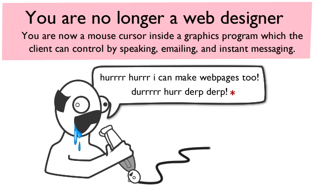
5) Know When To Say No

Some clients are used to having all the control over their business, so they’re used to knowing exactly what they want from something and they expect it to get done. There’s nothing wrong with that, of course, but when they forget why they hired you as a web designer and start treating you like an editing tool for their own whacky web designs…. you need to get that control back somehow. Know when to say no.
6) Indecisive Design

Back seat web design? Having to constantly change things back and forth while someone watches over your shoulder? Sometimes it can get a little frustrating.
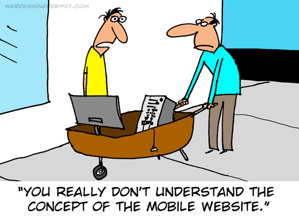
7) Delivering a Good Mobile User Experience

Mobile websites are okay, I guess…. If they’re done properly. But it’s all about responsive web design these days!
8) Mobile-Friendly Web Design

How to explain the importance of a mobile-friendly website to someone who doesn’t have a smartphone…? How to explain the differences in user intent when browsing via a mobile device? Hard numbers. That’s how.
9) The Dreaded IE6 Compatibility

It’s actually unbelievable how common an occurrence this is in the web design industry. What are people doing still using Internet Explorer 6? It was released in 2001! Most websites refuse to support IE6, but there will always be those who insist upon it.
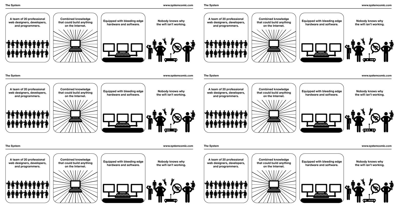
10) Web Designers Are Not IT Support

Being in a IT-related industry, you’re often expected to be a Computer Science and Networking expert. But this is really not the case. Web designers specialise in web design. Web developers specialise in web development. Programmers specialise in programming. It’s not our job to troubleshoot over the phone to you why your office can’t get on the internet. We only host your websites; we do not provide your internet service.
If you enjoyed these Web Design comics, check out our Top 10 Funniest SEO Comics!
Thank you to Dilbert, Hitreach, xkcd, Web Designer Depot, OK/Cancel, The Oatmeal and System Comic for these hilarious web design comics! There’s not enough of them on the internet!


Hilarious comics! Funny web design comics are one of the trending topics on the internet now a days. Best one is ” You really don’t understand the concept of the mobile website” As a designer I love see and read something about the designer.
Glad you enjoyed the post, Manash! I love nerdy comic strips like these :D