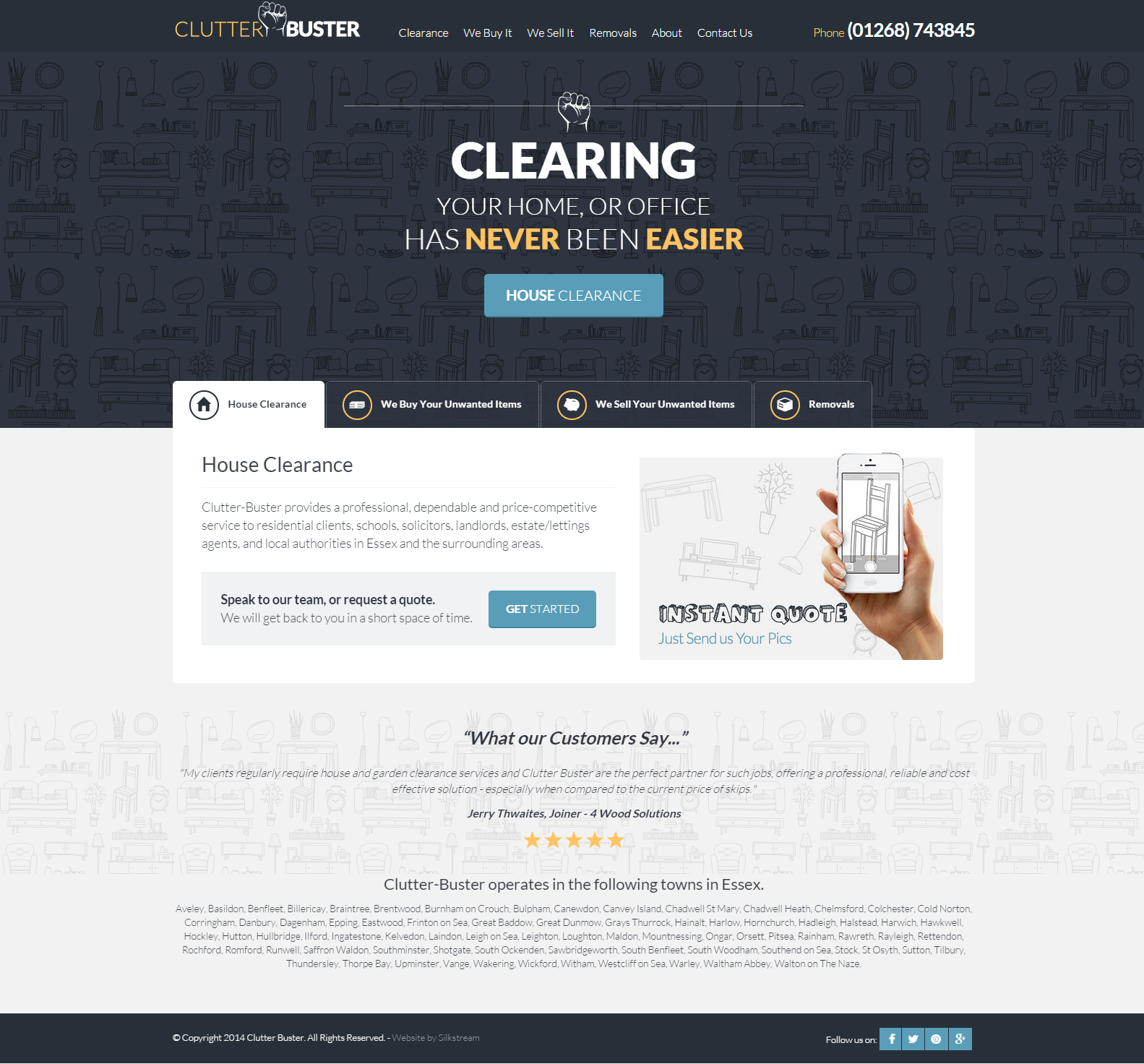
Silkstream were asked to design a brand new clutter-busting brochure website for Clutter Buster! The design had to be clean, modern and professional – but a little bit quirky. How do you think we did?
Who is Clutter Buster?
Clutter Buster provide a professional clearance/removal service throughout Essex. With over 25 years of experience, Clutter Buster offers house or building clearances, buy and sell second hand furniture and electrical goods, and also efficient relocation services.
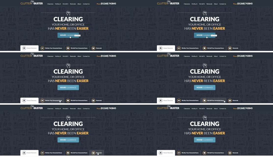
The Design
Upon arrival at the website’s homepage, the first thing to notice is the attractive way in which the background of the featured overlay scrolls horizontally. The smooth CSS-animated background draws the visitor’s eyes to Clutter Buster’s main branding, instantly making Clutter Buster’s website a memorable experience, with tabs that become translucent with a glass-like shine over the animated background when they are hovered over. At the top of every page on the website is the navigation menu and Clutter Buster’s contact number so visitors are able to directly call the company from any page. The Clutter Buster logo and branding was also designed by Adam, Silkstream’s web designer.
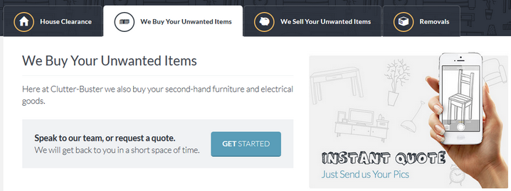
Each tab on the homepage, when clicked, changes the written content in the section beneath to briefly state what the service is and a Call-To-Action button prompting users to “Get Started” and request a quote.
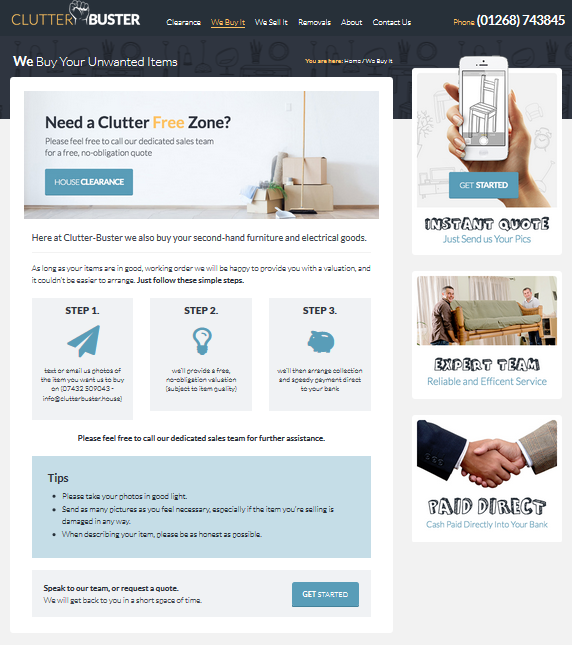
Each landing page, from the main navigation menu at the top of the website, explains the service in more depth than on the homepage and, again, with the “Get Started” button at the top and bottom of the landing page’s content. The featured image at the top of the page content is within an image slider, so the image will keep changing to different promotions and services, each with its own Call-To-Action.
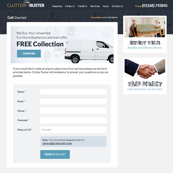
Clutter Buster’s enquiry form, where users are directed to when they click a “Get Started” button, provides a quick and easy way to contact Clutter Buster via this simple and elegantly designed enquiry form. Once users have familiarised themselves through the website with the services that Clutter Buster provide, they are able to make an enquiry or ask for a quote based on the information that they have read.

Each page features a testimonials section that displays multiple testimonials from Clutter Buster’s happy customers and slides between testimonials every few seconds with customers’ review stars out of 5. At the very bottom of each page on the website is also Clutter Buster’s copyright attribution and social media icons that link to their social media profiles.
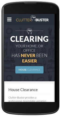
Clutter Buster’s website, like all of our website designs, is aimed to work smoothly and beautifully on mobile devices thanks to responsive web design. Having a mobile-friendly website has become a crucial factor for website design and development in this generation of ever-increasing mobile usage. Especially as Clutter Buster’s website visitors are encouraged to send photos as part of their instant quote request, and these days almost everyone is capable of taking quick photos using their camera phone.
Having a mobile-friendly website also means that any visitor to the website is able to locate all the information that they need and contact Clutter Buster quickly and efficiently, without the inconvenience of multi-directional scrolling that most fixed websites suffer from. To keep the website design clutter-free (as is the Clutter Buster way!), when the website is viewed from a mobile device the navigation menu is hidden away behind the tap of a menu button, and when activated slides across to reveal the website’s menu. Website content is re-sized and re-designed to make it easier and more attractive to read when browsing from a smaller screen.

