Talis Projects asked the Silkstream Team to dream up and develop an inspirational website to promote their inspirational office interior.
Who are Talis Projects?
Talis Projects offer stylish office interior design, refurbishment and furniture. They believe that office environments should be inspiring, encourage positive attitudes, good communication levels and a sense of self worth and well being.
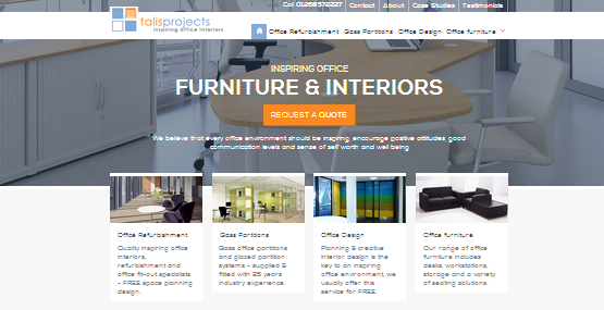
The Design
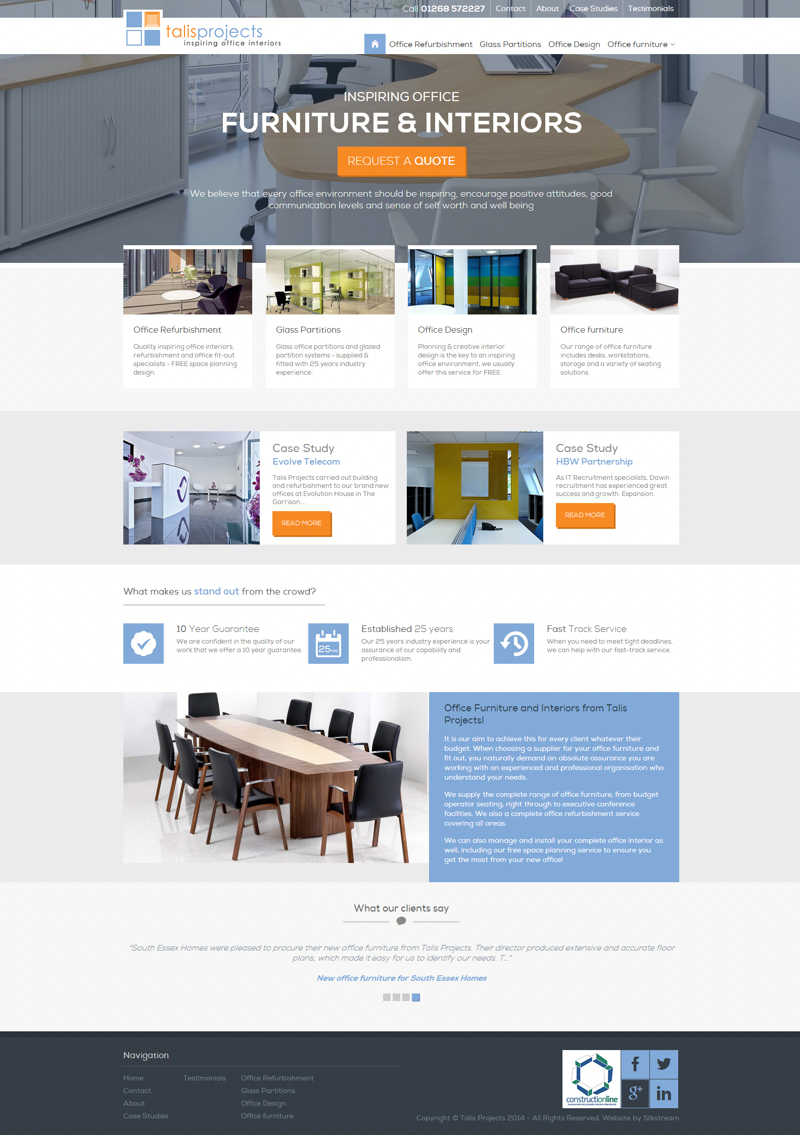
Talis Projects‘ new bespoke website is one of Silkstream’s small and simple lead-generation websites that proudly displays Talis Projects’ products and services in an attractive way, encouraging new leads and sales.
The homepage features a strong Call-To-Action for users to immediately request a quote upon first entering the website, followed by inviting image links of Talis Projects’ services and case studies. Very bold and very image-driven.
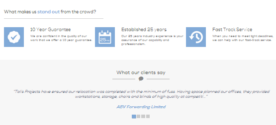
Each page, including the homepage, includes a “What makes us stand out from the crowd?”, listing their USPs on every page. Beneath this section, they also feature a testimonials slider on each page, alternating between different client testimonials and assuring visitors and potential clients of their existing positive feedback.
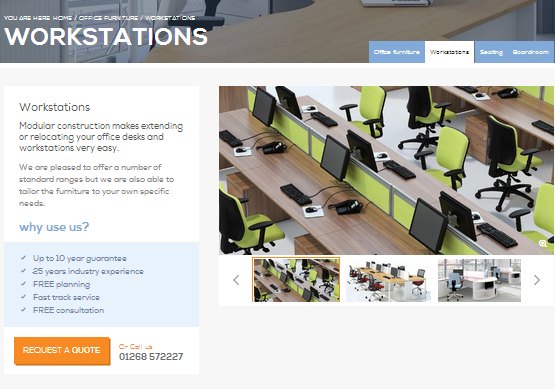
Products and services are categorised and subcategorised for easy user navigation. The product description is displayed beside the product image, above the “Why use us?” list and “Request a quote” call-to-action. Each product page includes a slider gallery, so that users can browse different real-world examples of each product, displaying the gallery image above the slider when clicked.
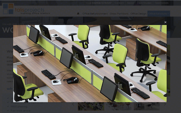
Clicking the image above the gallery slider opens up the image’s full resolution image in a cinematic view on the same webpage for closer detail.
Another feature of the Talis Projects’ website is the Case Studies gallery, in which visitors can browse through past projects that each display an image, the subject of the case study and a brief description of the project.
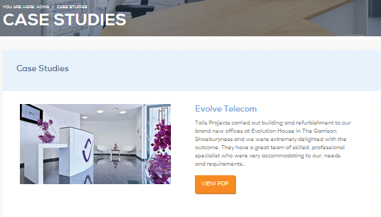
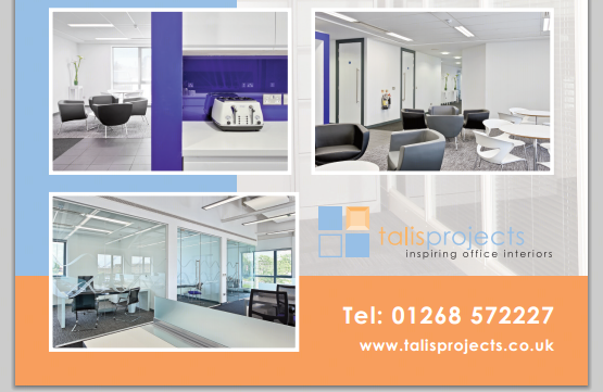
Clicking the “View PDF” button opens up the PDF file within the web browser, showing more information on the project and a number of attractive images showcasing their work for the company in a printable brochure format.
The About Us website page provides the user with more information on Talis Projects’ and their company philosophy.

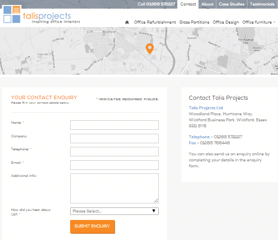
The Contact page displays an interactive Google map showing Talis Projects’ location embedded at the top of the page, with an enquiry form and contact details beneath.
Talis Projects’ new website, like all of Silkstream’s websites, will even work perfectly when being browsed from any mobile device thanks to our responsive website design! Using intuitive breakpoints to prevent inconvenient multi-directional scrolling, the website’s layout will adjust to the device’s native screen resolution to ensure that the visitor sees a layout optimised to their device no matter what device they may be browsing from.
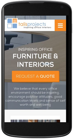
The navigation menu is at the top of the page, hidden behind a top of the top menu button, ensuring that the website’s menu content doesn’t clutter the user’s mobile screen. This way, Talis Projects’ potential clients are able to locate all the information that they need to go ahead and make an enquiry just as easily as they could on a desktop.


very nice and decent designs.