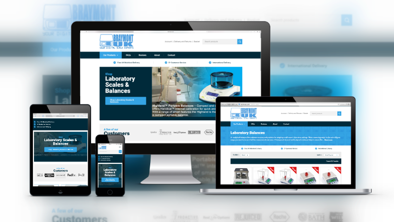
Ecommerce websites are our jam. We love designing them, and our clients love what we design. For Braymont UK, we were tasked with the design of the new ecommerce website to sell digital scales and analytical balances. The design had to strike a balance (pun ashamedly intended) between professional and bright colour scheme to match the branding. Obviously, the website also had to be mobile-friendly. But we would never dream of designing a website that wasn’t mobile-friendly in 2017. Navigation also had to be straight-forward for ease of use by Braymont UK’s B2B and B2C customers, and content is all easily managed with multiple ecommerce functionalities in the Silkstream ecommerce content management system.
The Homepage Design
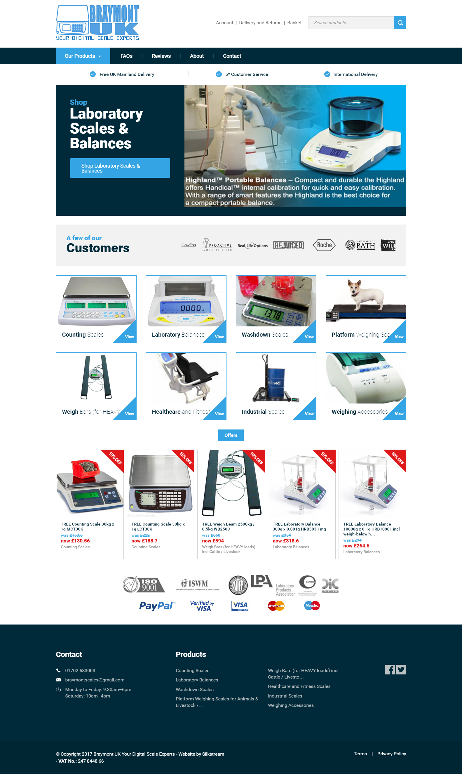
The homepage design is simple, with the main areas of the website accessible from the homepage. The top banner slides between the featured landing pages and is able to be edited and updated in the CMS admin with the ability for the client to upload their own featured images. Beneath is another sliding banner of their most notable customers, providing new users with confidence that Braymont UK are an experienced supplier of digital scales. A grid is displayed beneath this with images and links to their category pages for easy navigation, as well as their latest offers available. As an additional trust factor, Braymont UK’s accreditations and payment options are listed above the footer of each page.

The navigation bar displays a horizontal dropdown menu when you hover over the Products tab, allowing you to view all the categories without having to scroll down to the category list.
The Category Page Design
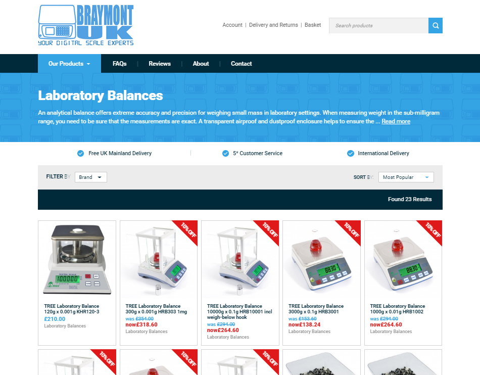
The category pages are simple but visually pleasing, with a grid display of the products contained within that category, featuring the need-to-know info and offer prices. Category pages can be sorted by Popularity and Price (low to high, and high to low), and users are also able to filter by brand. The category description is truncated to a maximum height so that users have the option to read more (which drops down the full description at a click), should they require more information about the category of products, without creating the unattractive “wall of text”.
Scrolling through pages is also a breeze with an “infinity scroll” feature, that will automatically load in new pages as the user comes to the bottom of the page so that they don’t have to click anything to browse the next page of products.
The Product Page Design
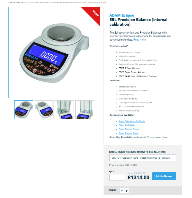
The product page displays a large image of the product, with thumbnails below that can be clicked to view larger versions of the different images uploaded. The bullet points display to the customer what’s included, the features, and which accessories are recommended to be purchased with the product. Customers can order in quantity, and select from a dropdown list of the different model versions available. The page can even be quickly shared to Facebook or Twitter.
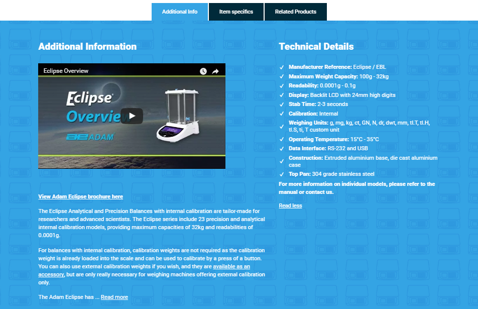
Additional information about the product can be read beneath, complete with a link to the brochure PDF and a YouTube video embed demonstrating the product. In the right-hand side column, is a list of the product’s technical specifications. There are two other tabs that will show different content in this space when clicked. Including the Item Specifics, which displays a specification table showing the technical details for the different model types available, and Related Products which displays the accessories recommended for purchasing alongside the product.
The Basket Page Design
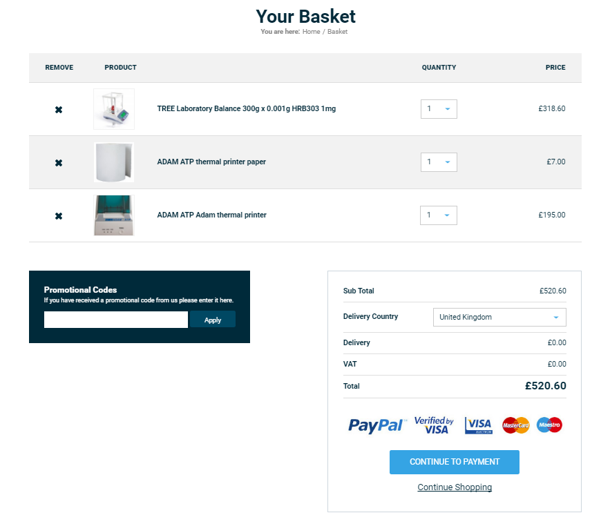
The basket page allows customers to edit their order before checkout!

