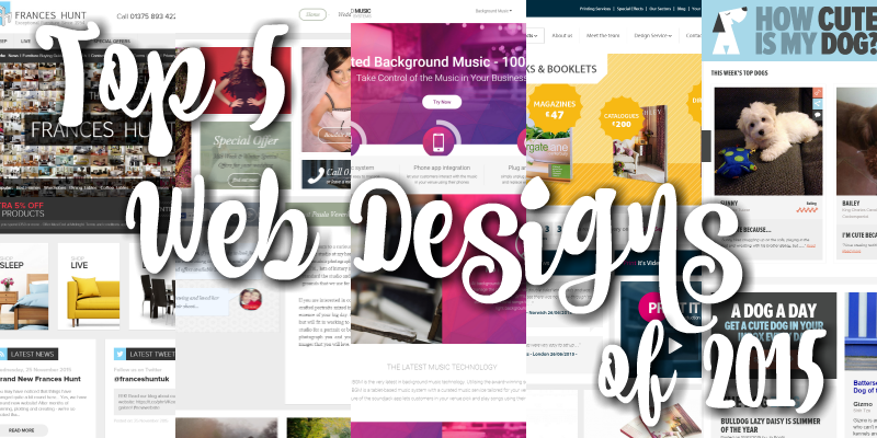
Adam and Tristan worked on over 25 website projects in 2015. Developing bespoke systems and features for clients’ websites, bringing old websites back to life with new mobile-friendly designs, and creating brand new ones from scratch for businesses. Check out our top 5 favourites of 2015!
1) Frances Hunt – Ecommerce Website
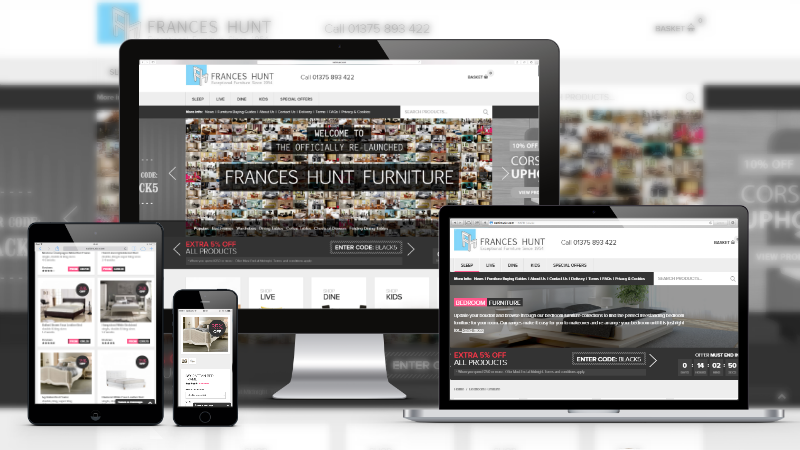
Our last re-design of Frances Hunt was back in 2010 so, as you can imagine, the website was long over-due for a revamp. With thousands of furniture products, Frances Hunt’s website was built to provide customers with a high quality ecommerce experience and the website’s content management system includes numerous bespoke features to do just that. The new front-end design has a very catalogue feel to it that makes buying furniture a breeze. Each category page, subcategory page and product page is designed with ecommerce SEO in mind, to ensure that they’re easily found on Google. As well as being optimised for search engine optimisation, we also manage their Google Shopping campaigns to drive more sales through ecommerce advertising.
2) Paula Veverka – Gallery Website
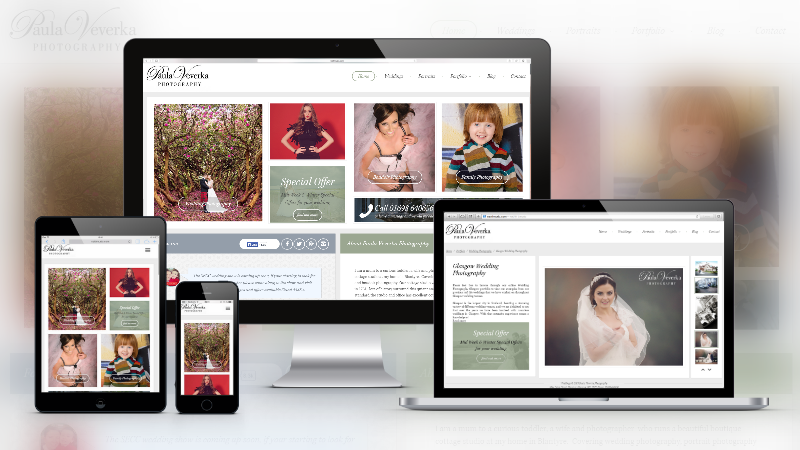
Paula Veverka is an extremely talented photographer based in Glasgow. Her new website needed to show off her photography portfolio. Using big, bold imagery, browsing her website feels as comfortable as flicking through the pages of a fashion magazine. During the design process, we also optimised Paula’s website for local search so that potential clients in her service area are able to find her online and browse galleries by location or category.
3) Background Music Systems – Brochure Website
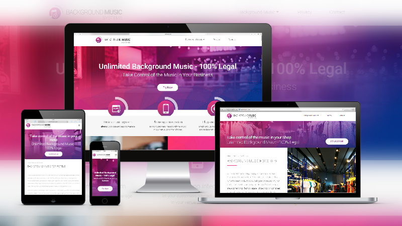
Background Music Systems provide an innovative new background music solution for businesses, allowing business owners to curate and schedule their venue’s background music through the tablet device with an option to even allow their customers to pay-to-play their favourite music in the venue, including shops, hotels, restaurants and pubs, using the soundjack app. The website had to be visually memorable and reflect the company’s modern solution to background music. The purpose of the website is to drive enquiries from interested businesses, so each landing page targeting different types of businesses is designed for conversion rate optimisation. In addition to the web design, we also manage their SEO and Facebook advertising campaign, that specifically targets UK business owners.
4) Print It – Literally a Brochure Website. But it’s Ecommerce.
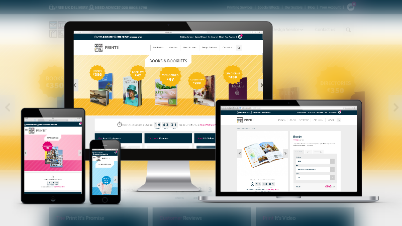
This brochure website is more than just a brochure website. We’re not new to designing ecommerce websites for printing companies, so we have experience in developing bespoke websites for printing companies to adapt to their individual requirements and price matrix. Customers can customise their print order by things such as number of pages, paper quality, size, quantity (and much more!) which will all affect the pricing accordingly, in contrast to a typical ecommerce system. Print It makes ordering printed products easy.
5) How Cute Is My Dog – Social Website. For Dogs
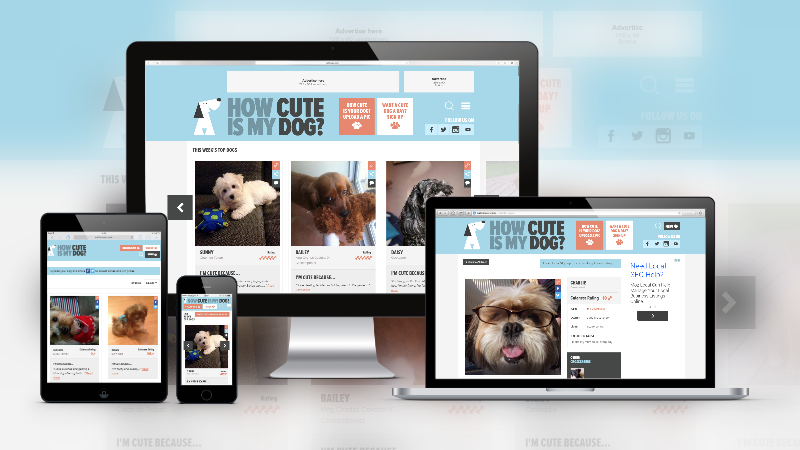
Not our usual sort of website project, but it definitely had the whole office “awww”-ing. How Cute Is My Dog is a social site for dog lovers, consisting mainly of user-generated content and monetised using Google Adsense with dedicated advertising spaces built into the design. On How Cute Is My Dog, users can register an account to browse through cute dogs, rate cute dogs (give the dog a bone which the dog can collect to win prizes) and upload photos of their own cute dog to create a social profile for their pup. The website is extremely easy (and addictive!) to use, and users can browse for specific breed dogs using the browsing filters.
Check out what else we’ve been up to in 2015! And if you like our style and think you could do with a new website, don’t be shy! Just give us a call and we’ll be happy to have a chat!

