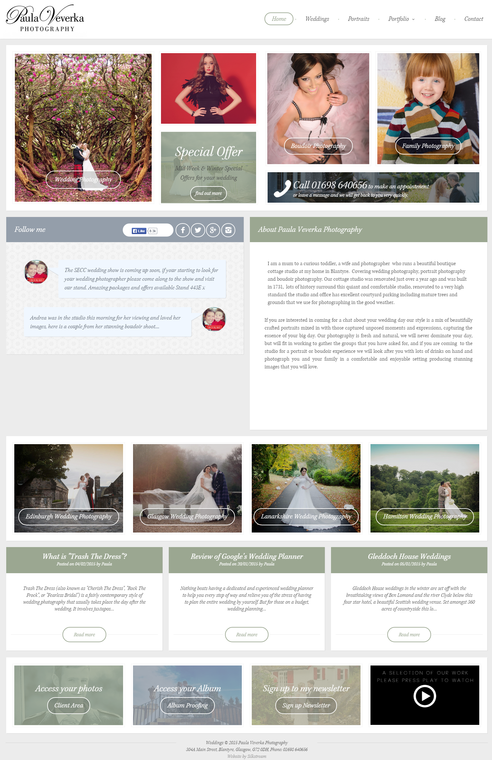
Silkstream were asked to re-design Paula Veverka’s photography website to make it more “2015”. The last web design for Paula Veverka’s brochure website was designed back in 2012 and, considering the latest trends and developments of web design over the past couple years, Paula Veverka wanted a website that she can use to truly show off her stunning wedding photography.
Who is Paula Veverka?
Though she has years of experience in providing a professional photography service throughout Glasgow and the surrounding areas, Paula Veverka is one of many Glasgow wedding photographers, so she needs a website that’s going to help her to stand out against competition.
BEFORE the Website Makeover:
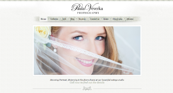
Paula Veverka’s old website, though still attractive, didn’t make use of modern web design trends to effectively show off her photography talents, and the website wasn’t as “2015” search-friendly as it could be.
The NEW Website Design:
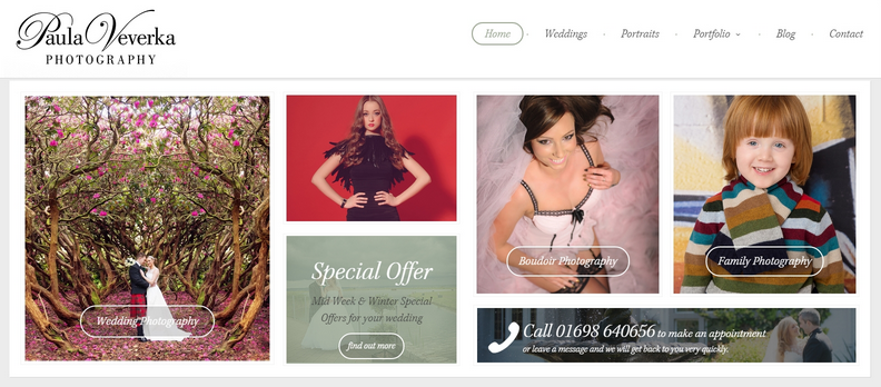
The new website design is a full-width beauty, that truly makes the most out of the user’s screen space with lots of room for big, bold and impressive imagery. Full width web designs are perfect for photographers. Above the fold, the homepage layout allows the user to quickly preview Paula Veverka’s photography services, with images linking to their corresponding landing pages. Hovering over each image will overlay that particular image with a translucent cover in the colour of the theme, and show a short written excerpt from the landing page’s content.
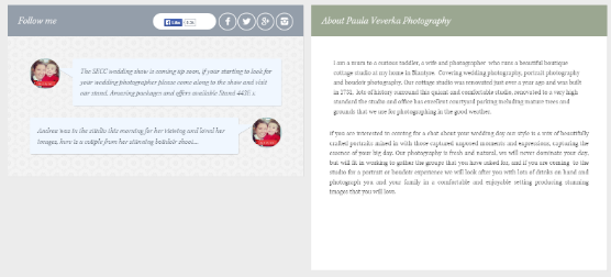
Paula Veverka Photography is very active on Facebook with thousands of followers and tons of engagement. Displaying her most recent Facebook status updates on the homepage as well as giving visitors an easy way to Like or view her Facebook page right there will be help to increase her Facebook following. Beside the Facebook section of the homepage, visitors can also read a little about Paula Veverka’s photography business and see her other social platforms.

From the homepage, visitors can also click on one of four portfolio landing pages for more information and examples of what they are looking for.

Beneath this, visitors can also see a preview of Paula Veverka’s most recent blog posts, which they can click on to read more.

The homepage footer provides links for existing clients, so that they can access their client area or album proofing right there from the website’s homepage. You can also sign up for a newsletter, or watch Paula Veverka Photography’s promotional YouTube video from the homepage.
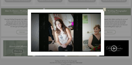
This way, Paula Veverka can update the video to show any YouTube video she wants, and the user can watch it without ever having to leave the homepage.
The new website features two landing pages that users can visit to read about Paula Veverka’s “Wedding Photography Packages” and “Portrait Photography Packages”.
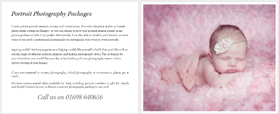
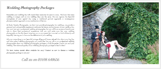
Each of these landing pages contains space for written content and a feature image to show off an example of Paula Veverka’s photography.
When users click on Portfolio from the main navigation menu at the top of each page, they will be presented with an option to view the Wedding Photography Portfolio or the Portrait Photography portfolio. Each of these portfolios contain multiple photo albums within that portfolio so that, for example, visitors can see examples of wedding photography at their chosen wedding location. Or people interested in having a family portrait can view examples of family portraits from within the Family Portraits photo album in the Portrait portfolio.
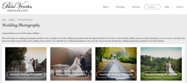
The portfolio will present the visitor with an option to click through to the photo album of their choice.
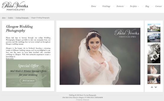
Clicking on a photo album within the portfolio presents the user with a sample of Paula Veverka’s photography for that category, which the user can browse through using the vertical slider on the right, clicking the up and down arrows to browse through the thumbnails. Clicking each thumbnail brings up the larger image. There is also space for written content to accompany each photo album, so that the visitor can read more about Paula Veverka’s photography service within that area or category.
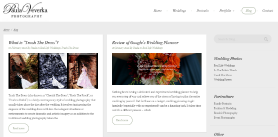
Paula Veverka’s WordPress-powered blog has also been re-designed to suit the rest of her new website.
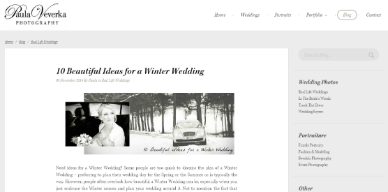
The blog, like the website, is now full-width too. So any photos that she posts to her blog will look big and bold!
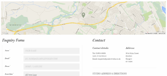
The Contact page features a full-width interactive Google map embedded at the top so that visitors can see where Paula Veverka is based in context to the surrounding area. Beneath the map, the visitor is also presented with an enquiry form so that they can send Paula a quick message, as well as Paula Veverka Photography’s full contact details, directions to the studio and opening times.
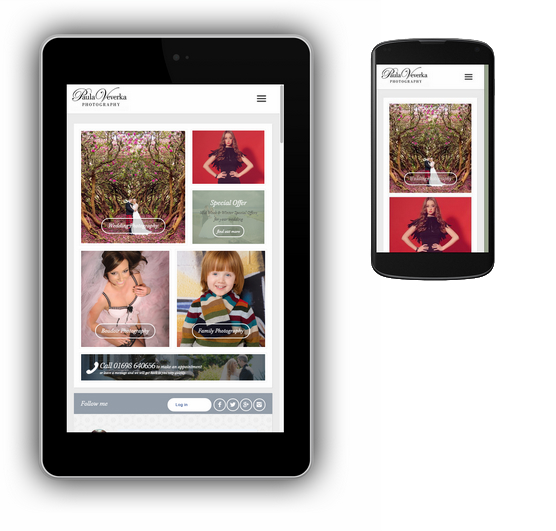
Responsive web design also means that Paula Veverka’s new website will look great on any mobile device!

