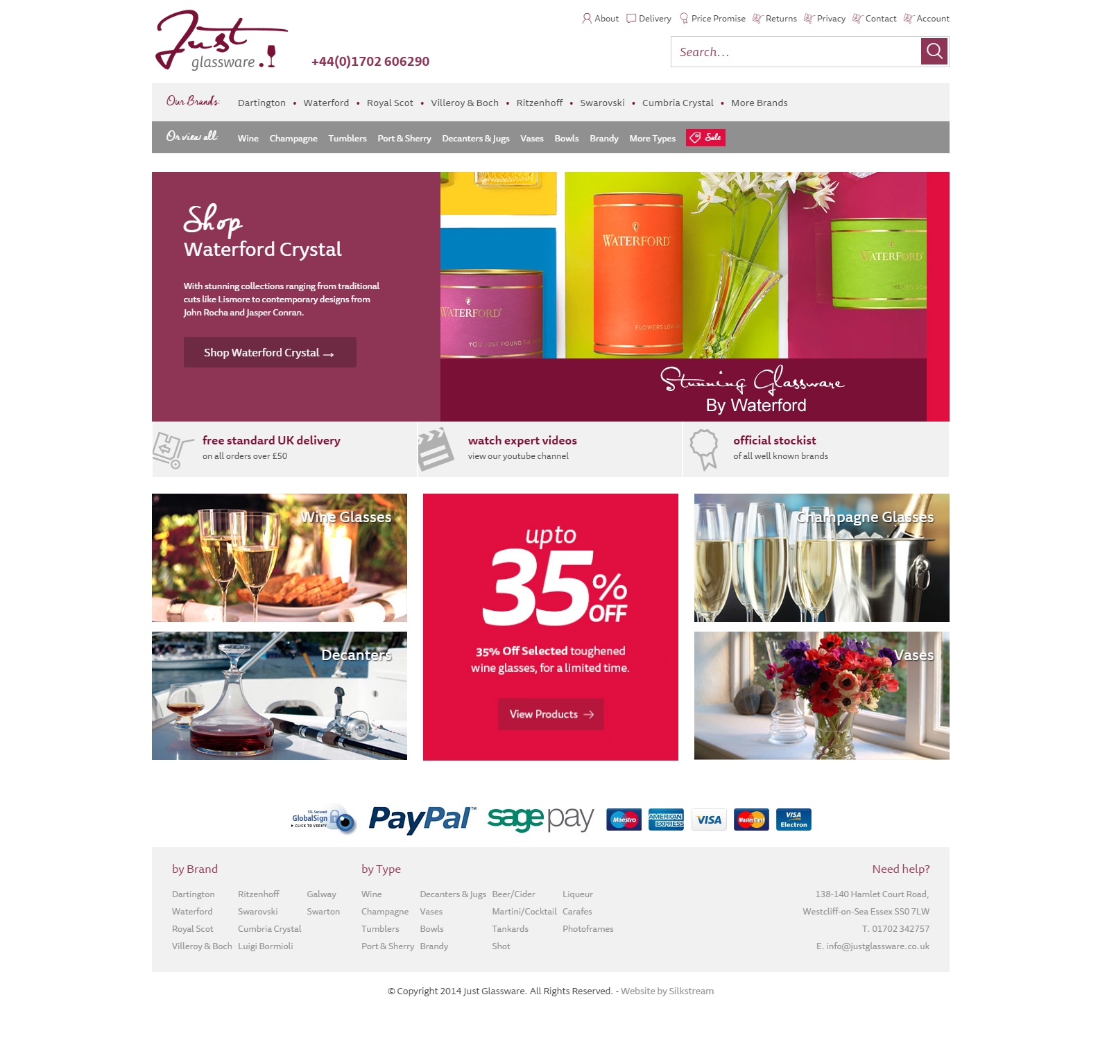
Having worked with Havens on their ecommerce websites since 2003 (currently in its fourth revision to keep up with the web design trends), we were their first choice when they were looking for a brand new ecommerce website dedicated to just their glassware products – Just Glassware.
Who is Just Glassware?
Just Glassware is part of the Havens group of companies, based in Southend-on-Sea. Havens have been in the glassware business for over a century and their new website, Just Glassware, specialises in… just glassware!
The Design
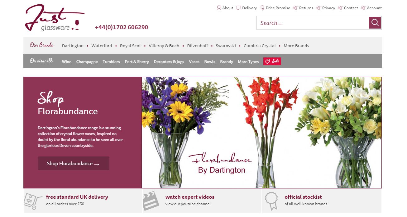
The homepage features a wide animated slider that alternates between different promotions or featured products or categories that Just Glassware would like to encourage traffic to.
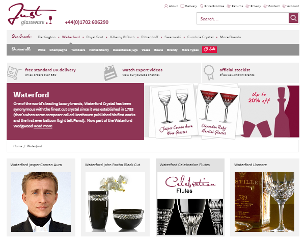
Category navigation at the top of each page is split into “Our Brands” and “Or view all”, which allows customers to browse by brand or by product categories like “Bowls” or “Vases”.
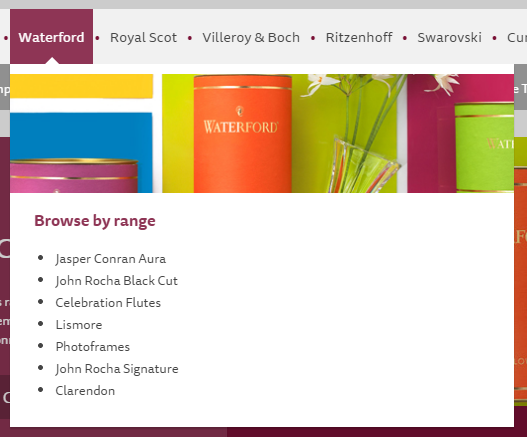
Hovering over a Brand category displays a drop-down menu of that brand, accompanied by an attractive featured image, allowing customers to browse the brand by range. When the drop-down menu is activated, the rest of the website in the background dims slightly which brightens up and gives more visual focus to the brand menu.
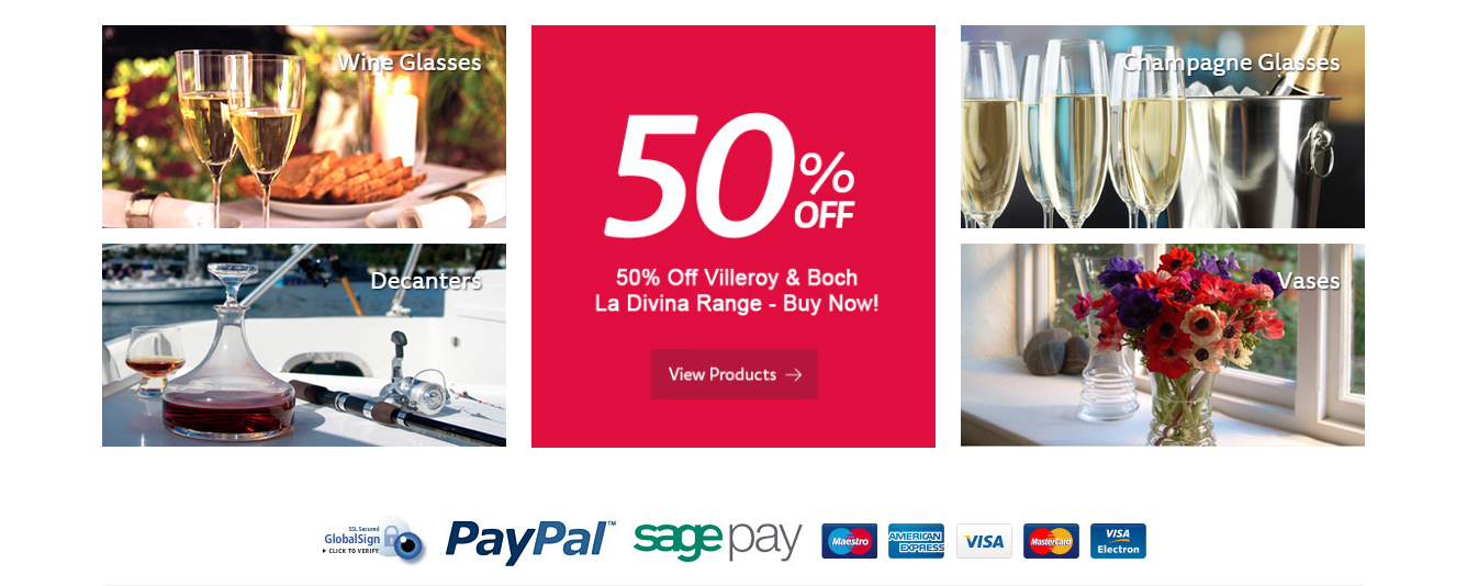
Below the homepage slider and the website footer on the homepage is a wide grid of Just Glassware’s most popular categories, along with a featured image promoting a product sale. Below this area, the website also includes some trust signals for users.
Brand category pages include a short text summary of that particular brand which, when “Read more” is clicked, expands to full width to allow for additional text content, which can be used for Search Engine Optimisation. Product ranges of the brand being viewed are displayed in an attractive grid, and the featured image of each range becomes magnified upon hovering over it to draw the user’s focus and encourage click-through.
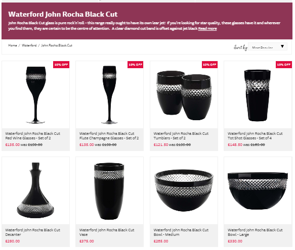
When you click through to a particular range, the products within the range are displayed in that familiar grid layout, and present the user with the product prices. Products can be sorted by “Most Popular”, “Price: low to high” and “Price: high to low”. Again, when a product is hovered over, the featured image of the product magnifies. Above the products is a text area that briefly describes the range, and can be expanded with a “Read more” button that will drop down for more additional text space when clicked, so that you can fill the page with written content without cluttering the page.
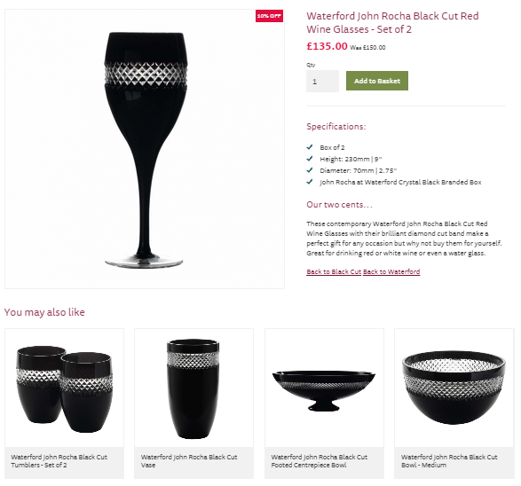
Clicking through to the product page, more information about the product can be read. Including the product specifications in a bullet-pointed format, as well as a more detailed product description. Below the product details, the user is also presented with alternative products that they may like based on the product which they are viewing.
Hovering over the main featured image of the product, magnifies the product to full-scale within the confined area, and moving the cursor allows the user to focus on various details of the product close-up.
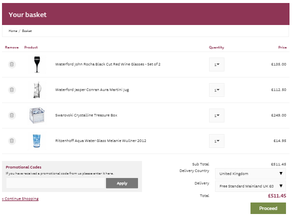
Adding a product to the basket brings the customer to the Your Basket page showing the customer the contents of their basket, but also providing the customer with the option to “Continue Shopping”. The basket page allows for customers to apply a promotional code to their purchase for a discount, and the page also calculates the total price of their shopping, including delivery costs. Of course, customers are also able to delete or modify products in their basket.
As well as the product and category pages, other top menu options include:
- About
- Delivery
- Price Promise
- Returns
- Privacy
- Contact
- Account
- Your Basket
![]()
This navigation menu appears at the top of every page on the website, providing the user with delivery information and website information, as well as a way to create and manage their own user account on the website.
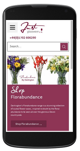
Like all of our website designs, Just Glassware is optimised to work smoothly even on mobile devices using responsive web design. By having a mobile-friendly website design, Just Glassware’s customers are able to shop using their mobile without having to scroll this way and that to navigate the website. The navigation menu is hidden away behind a tap of the menu button next to Just Glassware’s logo. All of the website’s content is resized and redesigned to fit onto any mobile device resolution, so the website is presented in a clear and attractive way even when browsing using a smaller screen.
Click here for a closer inspection:

