Product pages on e-commerce sites can often become neglected. People put so much emphasis on optimising and ranking the e-commerce site homepage, and don’t invest enough time in optimising the product pages as landing pages for product searches. With a few simple things to keep in mind you can increase the search visibility of your individual products, and by planning a good SEO strategy from the beginning of your e-commerce website development you can ensure that the e-commerce SEO basics are integrated into your CMS.
Optimising Product Images
Most e-commerce websites focus primarily on the product images, prioritising them more than the accompanying product description. After all, the images are really what’s going to dazzle your customers and sell your products! But search engines won’t be so dazzled. To them, it’s nothing more than a file. They’re living in Flatland and to them the file and file information are all they’re going to see. So it’s crucial to make the most out of your shiny, cool product images and make them readable to search engines.
“34254541.png” means nothing. Rename the image file to something short but descriptive. For example, “raspberry-jelly-headphones-01.png” for the featured image of Raspberry Jelly headphones (whatever they are). And make sure to include the all-important alt tags.
<img alt=”Raspberry Jelly Headphones” src=”raspberry-jelly-headphones-01.png”>
Not only will this give some context to the search engines who are then able to decipher what the product is, but it will also add more relevance to the rest of the content on the product page. And users searching for images of the product online, via Google Images or what have you, are more likely to see that image in the results. Which may result in a sale conversion. From Google Images. It happens more times than you think! So make sure your product images are high quality.
If possible, it’s always best to upload multiple images of the product (all optimised as mentioned above of course), highlighting its different features or captured at different angles so the user has more than one perspective of the product to convince them to buy. Some popular e-commerce websites even have a “3-dimensional” image of the product that allows the user to drag the image in different directions to rotate the product at all angles, as if they were in-store turning it around in their own hands. I appreciate that not everybody has access to that kind of technology, but just a couple extra photos of the product from different perspectives can be all it takes to persuade a customer that that’s the product they want.
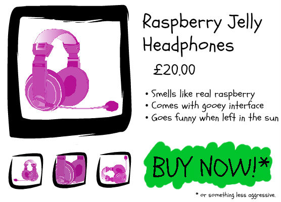
As for the product’s featured image, the one that should appear the largest on the page and represent the product at its best: A/B test it. It’s not always easy to know which image is going to convert sales the most. And some customers won’t even bother browsing the additional image slider or gallery. And from the category pages, the featured image in the thumbnail needs to entice the customer to click. Therefore the featured image has to do all the talking. The featured image is pretty packaging that’s going to really sell the item. If you’re indecisive about which image is more effective at this then you should consider A/B testing the images, auditioning them for the main role. Serve customers randomly one of the two potential featured images and after a period of time, once they’ve both had equal opportunity to sell the product, analyse which seemed to be the most popular with customers.
Optimising Product Descriptions
Though a few key bullet points of product specification, with price and delivery information next to the product’s featured image should be prioritised at the top of the page above the fold, it is important to include a longer product description elsewhere on the page. Having an additional product description that goes beyond the basic specification of the product allows you to expand on the product descriptively, and include the product’s target keywords without trying to cram them all in making the page look cheap.
You can see what keywords people are using to search for certain products using Google’s Keyword Planner and Webmaster Tools, and see how many impressions you are getting for those product pages and the page’s CTR (click-through-rate). Using these tools will help you to find the keywords you should be optimising your product page for.
Writing a unique product description for each individual product will ensure that you are not just using the default product information given by the manufacturer that most other e-commerce websites will be using. Be creative with your product descriptions! Let them invoke an emotional response from your customers. (But, of course, still keep them factually accurate. Don’t say something will give you wings if it doesn’t; it will only come back to bite you…)
Make an effort to vary your boilerplate product descriptions, particularly if you have similar products or multiple products within the same range. By writing unique product descriptions you are avoiding any duplicate content issues with other product pages on your website and the websites of your competitors.
On the subject of duplicate content, there are tools that you can use (e.g. Screaming Frog) that will help you locate pages with duplicate titles. You want to ensure that each product page is tightly targeting a very specific product, and this needs to be reflected in the page titles. The page title should contain the product name/model and brand, which is probably what your product page should be targeting in terms of keywords depending on the product. If you have multiple product pages targeting the same keywords, these pages may cannibalise each other and under-perform in the search rankings. It will also help to have the product title in a H1 or H2 heading on the page.
User Generated Content
Reviews, reviews, reviews. Everybody knows how important they are. Reviews build reputation, and can even reward you with funky stars in the search engine results page. Each review is an endorsement. They boost trust in the product, the brand, and more importantly: your e-commerce website. You could even encourage happy customers to upload their own photographs of the product they’ve purchased to accompany their review, so that other potential customers are able to see the product in real-life situations as well as read personal reviews so they know what to expect. People do not like to go blindly shopping any more. We need to hear everyone’s opinion on what they thought of something before we go out and buy it for ourselves.

By adding a product review system to your product pages, the product page will also be able to refresh the content of the page with each review that’s submitted, generating more text content for search engines like Google to crawl and re-index. Who needs a ridiculously lengthy, two thousand word, densely keyworded product description when your customers could be creating uniquely written keyword-rich content for you? (Not to eliminate the necessity of a good product description, of course, but they seriously do not need to be that long…)
Like comments on blog posts, industry experts have noted a correlation between frequently reviewed products and search engine ranking for a product page. Regular comments, reviews and other user-generated content, even on an old product page, pokes Googlebot to tell it that the website’s been updated and that the page is still relevant enough for people to find useful.
Read more about Google’s Fresh Factor!
So showcase your happy customers! Increase your conversion rate! You could even prompt customers for a review by shooting them a friendly email a week after the product’s expected delivery date, kindly asking whether they are happy with their product and the service of your company, and if so could they please leave a friendly review. Reviews are great feedback for an online business, as you are able to easily identify what you’re doing right and what you’re doing wrong so that you can improve your customer service.
But also make sure that any review system that you have set up to your product pages is heavily moderated, or you may see this backfire.
User generated content doesn’t have to stop at reviews though. Perhaps you may consider adding a Questions & Answers section on your product page, so that people who can’t find the answer that they’re looking for have an opportunity to ask their question on the page. If you are able to answer the product-specific question for them, it may reduce the risk of them asking a competing e-commerce site the question and having them sell the customer the product. With Q&A sections on product pages, it is important to be able to answer the customer’s question quickly. For example: the question gets published, you answer it quickly and they receive an email with the answer accompanied with a link to the product page, where the question and answer are also published on the product page. By having these answered questions displayed publicly on the product page, you are also updating Google’s fresh factor of the page as well as providing other customers with further product information that they too may have been wondering about.
Optimising Product Videos
If you have a YouTube channel or product video commercial/advertisements, why not embed your YouTube videos onto the product page? You could even create and upload mini ads onto your own branded YouTube channel especially for the product page to create a media-rich shopping environment for your customers. This could be anything from a 10 second video of the product slowly rotating 360 degrees for your customers to preview the product from all angles or a How-To video showing your customers what the product does and how to use it. It doesn’t have to be over-promotional; it can just be informative.
Having a product video may mean that you have more things to optimise for search engines, but it also enables more points of entry to your product pages. YouTube is the second largest search engine in the world, though most don’t take it seriously as a search engine. If you optimise your YouTube video for video search, with relevant tags and keywords, it’s going to rank well for the product name and maybe even for Google search. Video results in Google really stand out from the rest of the results, and having a video come up first page on Google’s search results guarantees views.

These two video results appear first page for “Logitech Wireless Keyboard K800”. Though they are positioned 4th and 5th, the eye-catching video thumbnail will attract the user’s focus.
If you were to have a link to the product page in the video description, those views could convert into sales. If you complete the video with a linked video annotation to the product page, you may also generate views, clicks and sales from elsewhere too should the video be embedded on another website or blog. It’s kind of like getting a free backlink for referral without even having to ask…
Encouraging Social Media Engagement
Displaying social sharing icons on each product page is becoming increasingly popular with e-commerce websites as they try to launch themselves into the world of social media to increase their brand visibility and social referral traffic to their website. Though this may not at first seem like a search engine optimisation strategy, people searching for that product may share the page on their Facebook page or other social media profile and some of these social pages get indexed. For example, I was recently looking for information on a specific product and a simple search for that product returned me a Facebook result on the first page of Google. It was just a regular public status update from a regular page saying how happy they were with the product, with a link to the product page which they purchased it from. Not only will all of the social media user’s followers see the product but unrelated users may also see the endorsement when searching for the product on Google.
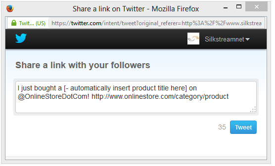
Another effective way to include social media sharing icons is on the purchase confirmation page (or Thank You page). For example, with Twitter, a Tweet This icon that Tweets “I just bought a [automatically insert product title here] on @OnlineStoreDotCom! onlinestore.com/category/product” may generate interest with the customer’s Twitter followers who may click on the link to see what the customer has bought. The purchase confirmation page is a great opportunity to influence the customer’s excitement to get some free advertising. Don’t let the customer navigate elsewhere immediately and forget about the product now that they have it ordered. They’ve just made a purchase! They can’t wait for it to be delivered! But in a minute or two they’re likely not to care any more until the product has turned up at their door step. So why not give them a platform to express their excitement while they’re still excited!
Optimising Product Page URLS and Site Structure
Make sure that the product’s URLs are search friendly by including the product name’s keywords in the URLs in a way that makes sense to the site structure. For example, “onlinestore.com/category/subcategory/product-name” or something similar. If a product is categorised under multiple categories, consider alternative URL methods such as canonicalisation or only making a webpage accessible via a single URL.
Structure your categories, subcategories and product pages effectively, reflecting the site structure accurately within the breadcrumbs, to make your pages easy for search engines to crawl and index. Brand new products could also be featured on the homepage to allow search engines to find them and index them quickly.
Write unique and highly targeted content, containing the collection of products’ broad keywords to ensure that parent categories of product pages are just as optimised as the product pages for the broad terms. This way they will work effectively as silos for each category’s child products. If all products are categorised properly, and the category pages are equally as optimised for search engines, it should help the overall ranking of the individual product pages.
Structure and Optimise Your Product Page Data for Search Engines
Web developers are able to use Product Schema to “label” aspects of the product page template in order for search engines to be able to recognise and structure different product data. Using this markup, not only will search engines like Google understand the different properties of a product, but it can also display the product differently within the search results. Bing, Google, Yahoo! and Yandex all rely on Schema markup to improve how their search results are displayed to their users.
You can see how the use of product schema has affected how the search result is displayed for an example product below:

Whilst the search result of a different seller selling the exact same product doesn’t pop off of the page quite as much:

Schema properties used for products include: brand; color; aggregateRating; isRelatedTo; isSimilarTo; manufacturer; review; description; image; and loads more.
Though not strictly product page SEO (or e-commerce SEO), markup can also be used to “structure” the website’s search engine. So that in Google’s results, users may see something similar to this when performing branded searches:
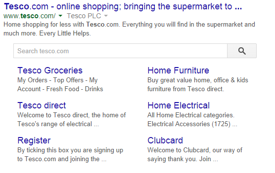
Having a search function within Google Search that searches through the content of just your website provides a quick way for search users to search for products on your site. However, how your search engine works and how your content is optimised for the search engine may affect its accuracy. Not just on Google, but on your actual website. For instance, if you contain product information within iframes on your product page, the content may not be readable.
Many e-commerce websites are still displaying their product information within iframes. There are many reasons why some choose to do it like this. Sometimes because they are not actually selling the product themselves and are partnered with the manufacturer/distributor as a form of advertising in order to get a small commission for each referred purchase. They are displaying the product information within an iframe widget of the manufacturer or distributor’s website. Though becoming less common, displaying content within iframes is bad SEO practice. Search engines won’t be able to crawl the content within the iframe, and nothing within it will benefit your website in terms of SEO. Product pages should contain their own content that search engines are able to read and rank the web page accordingly.
What to do with Out of Stock Products
If an item is out of stock, don’t hide the product page – it’s a wasted opportunity! Instead you can give the visitor alternative products that may be to their interest based on that particular out of stock product or range, which also lets search engines know of other relevant product pages on the website. If the page returns a 404, not only will potential customers perhaps go elsewhere looking for that product when something that they perhaps would prefer could have been suggested instead, but other websites linking to that product page will result in the referred users bouncing off the website, and you may even be losing a valuable backlink. If you plan on re-stocking the item, you could allow the customer to request a reminder or a pre-order for when the product becomes available again (perhaps incentivising a pre-order with a small discount to ensure that the customer commits to the purchase and doesn’t order it elsewhere).
Alternatively, if a product has been discontinued, you could permanently 301 redirect the product page URL to the product’s parent category or, if one exists, to the newer version of the product.
Highly anticipated products that have yet to be released should have a product page ready and published with “Coming Soon” or something similar that indicates that you will be stocking the item, with perhaps the option to pre-order or request a reminder when the product is launched. That way you can get in there earlier, and start ranking the product page before the anticipated release date.
Give Your Customers a Sense of Security
It’s no secret that Google’s a little bit tougher with YMYL (Your Money or Your Life) websites when calculating the search quality of websites. That means e-commerce sites, falling under the Your Money category, have to hit a high standard of quality for Google to rank highly. This year, Google also released the information that HTTPS is indeed one of their many search ranking signals – so it should be obvious that e-commerce websites in 2014 absolutely need to have an SSL certificate.
For more information, read: “Does my website need an SSL certificate?”
If you care about the security of your customers, Google will think more highly about your website. Having a secure website will also affect the decision of your users on whether to buy from your e-commerce website or not. As the general internet population become increasingly aware of online security, more and more users will completely refuse to buy anything from an online store that cannot guarantee them security. Using images on your product pages that promote your website security will also help your customers to trust your website. So display your certificates and include trust signals on each product page (accurately!), so users won’t even think twice about their online security. And nor will Google.

It will also comfort your users to see an easy way of contacting the website should they run into any issues. So if you have a phone number to display, have it within sight somewhere on the page. Or if you just have a contact page, make sure that it’s clearly displayed so that potential customers are able to make enquiries about the product or at least settle their mind knowing that you’re just a click away if they need you.
Using E-commerce Analytics to Identify Trends
You can use an e-commerce website analytics tool such as Google Analytics to identify the website’s most popular products against different metrics (such as conversion rate, duration of time spent on the page, number of session, and so much more) in order to optimise your most successful or most popular products first and then work downwards. Or find the product pages that are perhaps performing below average when you benchmark against your average product page performance, and find solutions as to why they are receiving a high bounce rate or a low click through rate – perhaps the keywords you’re targeting do not match the search intent of the user. But you can also use analytics to identify and take advantage of certain trends that may not at first seem so apparent.
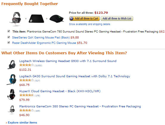
Sometimes e-commerce websites include a section on their product pages displaying related products that their customers may also be interested in based on the product that they’re viewing. Having a related products section can add further context to the page for search engines, to help them relate which products are similar or connected in some way to help improve the search engine’s understanding of what the product is. Using an analytics tool, you can identify the products that users are also interested in when they visit a particular product page. You can see an example of this on Amazon, where they display other products that are frequently bought together with the target product of the page, as well as common alternatives to that particular product that show what customers sometimes end up buying instead of the product that they’re viewing:
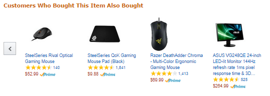
Amazon also display a product slider of other products that are commonly purchased alongside the target product. The reason behind this is because, if there has been a trend of users who have purchased the target product and then have bought an additional product, new customers may be inclined to also make the same purchase since it has proven to be a popular combined purchase historically. These customers may not be browsing for any other products, but by displaying these choices to them Amazon can benefit from those impulse buyers.
By looking at the Users Flow in your analytics, you can see how users who came specifically for one product browsed through others within their interest. Use the Users Flow to spot any trends in related interests, even if the products aren’t necessarily the same. You might sometimes look at the analytics and think to yourself, “why do the people that like this style keyboard by this brand also suddenly like this completely different style mouse by a completely different brand?”. It might not make sense to you at first, but if the two seem to be popular together with a vast majority of your users, then figures don’t lie. There may have been a YouTube celebrity review or an e-sports celebrity who recommended these two different products, and now their fans are looking to buy those two products too. Maybe the two products appeared together on TV and now customers are looking to buy the two together. Never underestimate the power of influencers. Keep on top of trends that relate to your products as they can massively affect your sales strategy and therefore how you optimise the products for search.
Keeping Your Customer Focused on the Goal
The ultimate goal of any product page is to get the user to click the big button that says BUY NOW! So the last thing you want to do is distract them. By cluttering the product page with too much stuff above the fold, you are confusing the users who may otherwise be committed to buying. Ensure that goal priority is given to the actual product that the page is trying to sell. Include clear CTAs (Calls To Action) that attract users who have already been persuaded to buy. By keeping product alternatives below the fold and product description you aren’t distracting customers with new options when you’re still telling them about this one. Customers are easily confused when shopping, and they may end up browsing in an infinite loop of alternative products without actually buying anything. Alternative products should be presented only at the point on the page when they’re questioning their decision on the product. Product pages should be crafted with the Buyer’s Journey in mind.

