What’s wrong with my old (static/fixed) website?
It’s 2014. If you haven’t updated your website in at least 5 years, then chances are that your website looks pretty atrocious on a mobile.
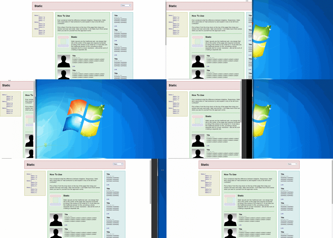
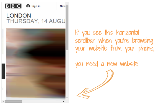
The quick way to test what your website looks like on mobile is to go to your website and resize your internet browser to see what happens. If you see a horizontal scrollbar at the bottom of your webpage and your website looks “cut off”, then you most likely have a fixed website. Fixed websites have set widths, sizes and layouts so how it’s displayed won’t change when you’re viewing from different devices and resolutions.
According to very recent statistics (published 7th August 2014 by the UK government’s Office for National Statistics), 68% of adults in Great Britain access the internet via a mobile device every day. Can you afford not to have a mobile-optimised website in 2014?
Responsive Design VS Adaptive Design VS Mobile Website
It is important to know the differences between responsive design, adaptive design and mobile sites so that you are able to make an informed decision when exploring the options for optimising your new or existing website for mobile devices. Each option has its own pros and cons, and you need to decide which type of mobile-friendly website is best suited to your business – or, more importantly, your customers.
Responsive Web Design (RWD) Pros and Cons
Pros:
- There is no need for a new domain as it’s just a change in the design of the existing website, rather than a standalone website on its own.
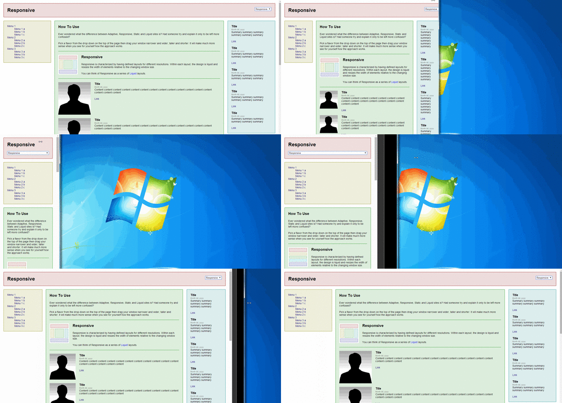
- Genuine responsive web design is fluid, which means that it is built so that the website’s design and content scales up and down, fluidly responding to the size of the browser. This is handled client-side by a single template which uses ems or percentages for width sizes (e.g. max-width:100% for a full browser width image or element). By client-side, we mean that the page is sent to the browser, then the browser decides how to display the webpage in relation to its size.
- It works well for simple websites with similar user intents between those browsing via mobile and via desktop, as they can be served the same content – just visually optimised for the user’s device.
Cons:
- As it is the exact same website on your mobile as it is on your desktop, it will still have the same content size and complexity as the desktop version, just laid out to look better on a mobile device. This means that if the website is quite heavy, those browsing from their mobile may experience slow site speed issues. From a search engine optimisation perspective, Google can sometimes penalise websites that load too slowly on a mobile – as a slow website delivers a bad user experience. Slow mobile websites will also usually suffer from a high bounce rate from mobile devices, which is the tell-tale sign in your website’s analytics if you’re serving a lower quality mobile experience than your desktop.
- Some images just don’t scale well.
Adaptive Web Design (AWD) Pros and Cons
Pros:
- Like with responsive web design, as it’s just a change in the way the website is displayed and not an entirely different website in itself, there is no need for a new domain to handle your mobile users.
- You can target specific device sizes and user agents, so you can choose specifically how to display a website to an iPhone 5 or other mobile device model. There have been examples of this where e-commerce websites have actually displayed higher prices for products/services if the buyer was shopping from an iPhone, under the assumption that Apple users tend to have higher disposable income.
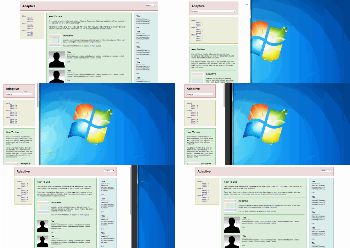
- Based on the device’s capabilities that are detected, you can choose to add/remove functionalities server-side (meaning the web server chooses what to show; not the web browser). This means that you can tailor the website content to the user’s intent based on mobile or desktop browsing. It chooses from multiple predefined layouts for each browser size detected.
- The website is capable of serving smaller images and content for faster load times on mobile devices with limited bandwidth. It can also detect retina display devices and serve the appropriate high quality images for those devices.
- Can incorporate responsive web design features. This is a common approach to designing modern websites, as it allows for flexibility.
Cons:
- Has to be highly optimised to deliver most suitable content to each device and bandwidth to get the most out of an adaptive web design. Most websites using adaptive website design only use it for its aesthetic functions, rather than its practical server-side capabilities.
- Designing each layout and the way in which the content is displayed across various screen sizes can be time-consuming to develop.
- Can be incredibly challenging for larger websites to optimise their entire website using adaptive web design, which is why a lot of big websites don’t. Not because they don’t want to, but because a complete restructuring would be extremely costly – financially and in terms of completion time and potential user experience risks during the restructuring.
Mobile Website Pros and Cons
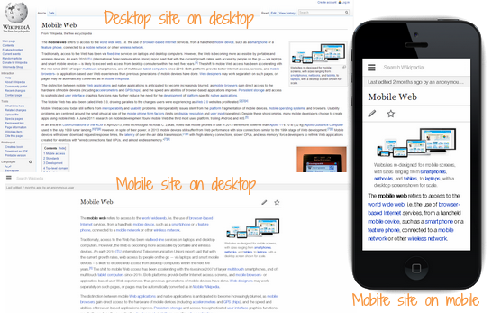
http://en.wikipedia.org/wiki/Mobile_Web & http://en.m.wikipedia.org/wiki/Mobile_Web
Pros:
- You can allow the user the choice of browsing via the mobile version or desktop version of the website. (Usually in the footer, there are the options to “Visit Mobile Version” or “Visit Desktop Version”, so mobile users can still use any desktop functionality that the mobile website has decided to exclude for whatever reason.)
- You can easily create highly customised mobile user experiences, tailored to the browsing habits of someone using a mobile device.
- It’s literally a mobile-friendly copy of your website. It’s an entirely different website with the purpose of providing the user with the best way of viewing the website for a mobile device, instead of the same website just being rendered differently for smaller screen sizes.
- You can set up each individual page of the main website to redirect to the mobile version automatically if it is detected that the user is browsing from a mobile device. So though it’s under a different domain or URL than the website user is accustomed to, they won’t be able to tell the difference or have to remember the mobile version’s website address.
- It’s relatively quick and easy to create a mobile version of the website in comparison to optimising an entire main website’s design for mobile browsing.
Cons:
- Maintaining and updating the website may be more difficult, as it is a separate website.
- Google have a bias toward responsive/adaptive designs as they have one URL and serve the same HTML regardless of device, so it’s easier for them to crawl and index. Though Google promote adaptive/responsive web designs, if the mobile version is well-optimised they won’t penalise you in any way for opting for a mobile site. Amazon, Wikipedia and eBay all have mobile versions of their website.
- It can potentially hurt your website’s search engine optimisation if not done properly, due to complicated redirects and not setting up page canonicalisation properly so it causes duplicate content issues.
- May face issues with sharing and linking websites between mobile and desktop as the website has to have its own domain, subdomain or subdirectory (e.g. mobilewebsite.com, m.website.com or website.com/m/). A potential customer visiting from a desktop browser may get confused or annoyed at opening a shared link from their friend who linked from their mobile version of the website, and having to browse through the mobile version on their desktop.
Points to consider…
The user’s internet behaviour is vastly different when browsing from a mobile device than if they were to be browsing from a desktop computer. Often when people are out in public, communications with a business can have more urgency for information. They may be looking for something specific like a phone number or address, or looking to book an appointment. It is important to ensure that your website provides mobile users with the information they need easily without any confusing navigation.
Using Google’s Analytics, you can see which mobile devices are most popular with your website’s demographic and you can use this data to make an even more informed decision. (But be aware that trends can change!)

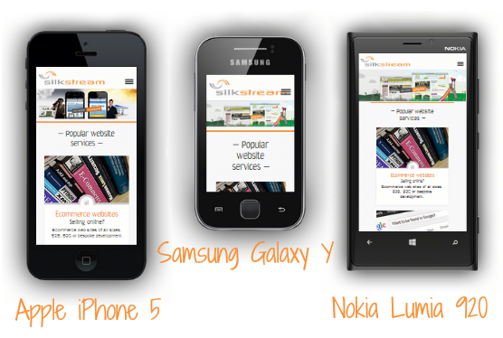
Websites can look very different when viewed from different mobile devices. For example, take a look at how the Silkstream homepage looks when viewed from the Apple iPhone 5, Samsung Galaxy Y and the Nokia Lumia 920.
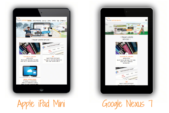
Different mobile devices have different screen sizes and resolutions. Check out the Silkstream homepage when viewed from a tablet: Apple iPad Mini and the Google Nexus 7. Again, both look very different.
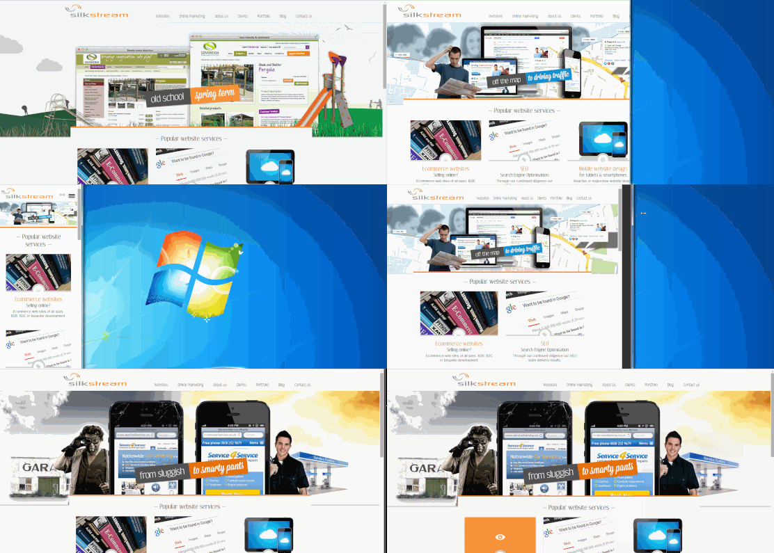
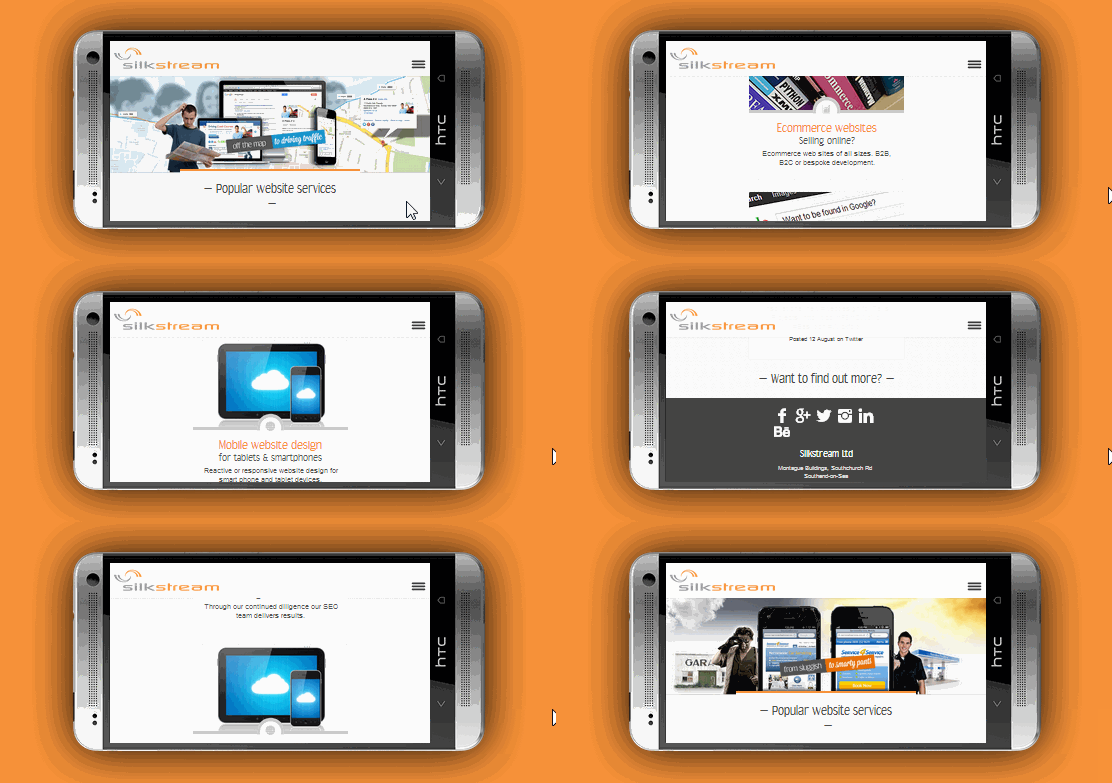
The Silkstream website is designed to look good and work well with any browser size:
And of course you’ll also need a website that’s SEO-friendly (as in easy to find in Google, Bing, Yahoo, etc), because what’s the point of having a beautifully designed website if nobody’s going to find it when searching? How search-friendly a website is will also have impact on your choice between the different mobile-friendly website types.
So…
The question is…
Which mobile solution is best for your website?
Contact us to discuss your website!


thanks. i prefer responsive websites even for mobile. actually it saves cost of getting another mobile version website developed. so responsive websites save money and at the same time opens on every device.
It seems that the drawbacks are only with the actual development and implementation on larger websites. Totally depends on the website, which direction to go optimising for mobile devices.\n\nThanks for the comment!
Yeah Ria I’m agree with you, drawbacks are only with the actual development and implementation on larger websites. Other wise responsive website designs are best. It save money and it also save time for designing a website.